Usability issues with new translation page as of today


In Iceweasel 3.0.6 (a Firefox clone under debian Linux), the new page presumably listing message to be translated or updated as of today:
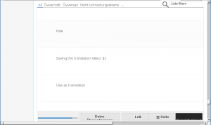
- shows message texts but not their names,
- has excessive amounts of unused white space to the left of messages,
- has excessive amounts of vertical white space between the messages, thus even with very short mesages only three of them fit on one screen with window maximized,
- show the untranslated messages laking a link to start the actual translation process of them,
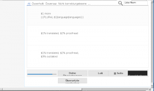
- displays some boxes looking somewhat garbled as its low end.
For details, see the attached screenshot from the middle, and the attached screenshot of the pages end.
I know, 3.0.6 is not the most recent version of Iceweasel, but there is little chance for me to upgrade to a newer version any time soon lacking appropriate hardware.
Then it appears you are out of luck. To use Translate, a recent browser is required.
It is recent, but not the most recent.
I don't mind as you know, but please be aware that answers like this may be insulting to translators in less advantaged parts of the world who may be chanceless ot get quick internet connections or powerful computer hardware. I don't know, if we have any of those here, though.
Well, you can revert to the old interface by putting "?tux=0" (or "&tux=0" if there is already a question mark in the URL) in the URL. For example: translatewiki.net/w/i.php?title=Special:Translate&group=core-0-mostused&tux=0.