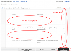
So called "new" interface completely unusable
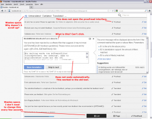
3 is already filed; 2 should be if it isn't (with steps to reproduce); 1, 4, 7 are – I suspect – just due to the fact that the new interface doesn't support old computers and small screens; 5, 6 are rather basic needs for experienced translators but apparently most translators don't need them.
Now that I think of it, there's a bug in Vector that reminds me of 2: does the placeholder keyword in the normal Vector search bar work for you? It should stay on the background and disappear as soon as you type something else.

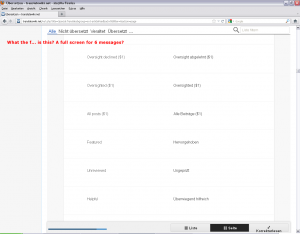
"steps to reproduce". There are no steps. Call a random translation page like this: [1]. Done. You will see the result in the screenshot.
"the new interface doesn't support old computers and small screens". This is a 1680x1050 screen and a 2.5 GHz quad-core. The only thing is that I did my test with Internet Explorer 9 (on purpose) and I shrinked the browser window (on purpose). Internet Explorer 9 is not old in any way. Such a simple tool (all it does is editing single lines of text) must work in a 2 years old browser under all circumstances.
"does the placeholder keyword in the normal Vector search bar work for you?" Sure it does. I would have filled a bug report years ago. "It should stay on the background and disappear as soon as you type something else." The text in the filter input does the same. It goes away when I focus the field. That's not the problem. The problem is that the default text is used to filter the list right from the start. Every time.


"apparently most translators don't need them." Your opinion. I use then. For what reason are useful tools removed? Why is it forbidden to open two translations the same time? What's the reason for this? It worked in the old interface. It still works. What was wrong with this degree of freedom?
I tested the interface with some other browsers (Opera 12, Firefox 9). It's the same mess everywhere. It wastes huge amounts of space for absolutely no reason. Like it is made for a 2560x1440 pixel screen (and only for such big screens). The whole proofread page looks like it's complete broken. Non-responsive interface elements cluttered everywhere and so much space wasted that only 3 (three!) messages fit on one screen. It's impossible to do anything useful with this. I don't see anything because everything I saw before is now outside of the screen. It's like I look at the page through a tiny little hole.
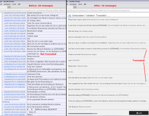
There is something called a "page" view. It wastes so much space that only 6 (six!) messages fit on a screen. The "list" view shows 16 messages. The old interface showed 36 messages in comparison. More than twice the count! And they were not truncated like they are in the new interface!
I really try to understand and to give it a chance. Really. But I can't. It does not make any sense. What is better in the new interface? I don't find a single bit that is better. Just confusion, broken stuff and insane amounts of completely useless white pixels.
Please define the minimum requirements to use the new editor, and add to the documentation for translators, if not already done.
I also need and make use of the feature requested as 5 above a lot and all the time. I can and do of course use multiple browser windows which isn't always comfortable but workable. The new translation interface limits the number of useable browser windows even on modern computers, making them too slow to work with and finally killing at least Mozilla after a while of work and window switching.
Also I "don't want to waste my time with scrolling in tiny little frames." While the new interface put another hell of a lot of unneeded partly duplicate drivel around the translation work fileds, I criticise also the last editing screen being too full and far too unflexible to the make the needed adjustments. Now it is worse yet another time. As a rule of thumb: When you introduce a new subfield somewhere, make it both detacheable and completely resizeable in all directions even if not detached, and provide for a way to keep such user-made settings forever (plus a "restore factory default" for those who messed it up)
It's a common and almost ubiquitous mistake not to limit the hight of sidebars and navigational colums in websites. Mediawiki (with most of its skins) has it, too. It apears even more stupid, and is driving me mad, as it's most easily avoided with somewhat better CSS. You can avoid it providing a local CSS if your browser supports it.